Swatus
Swatus 企業識別系統
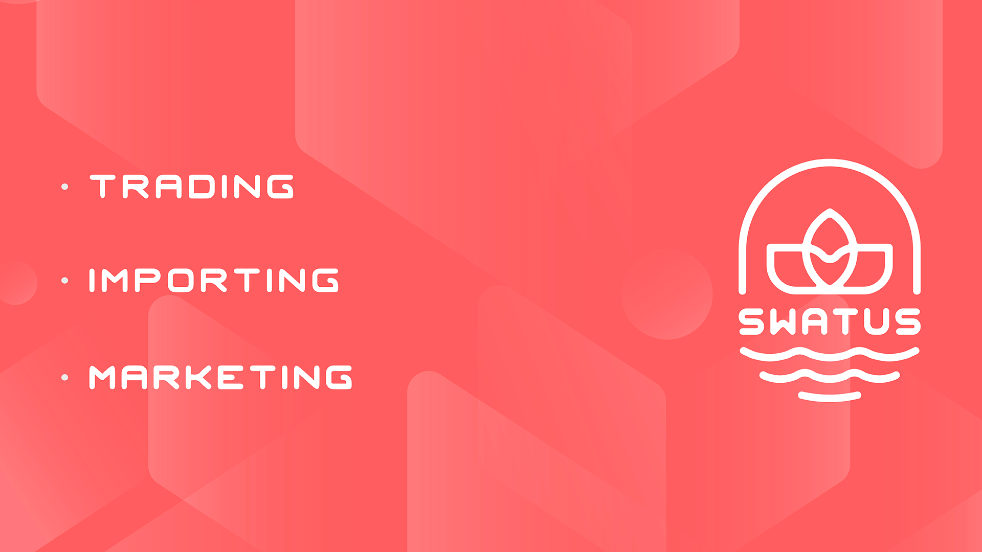
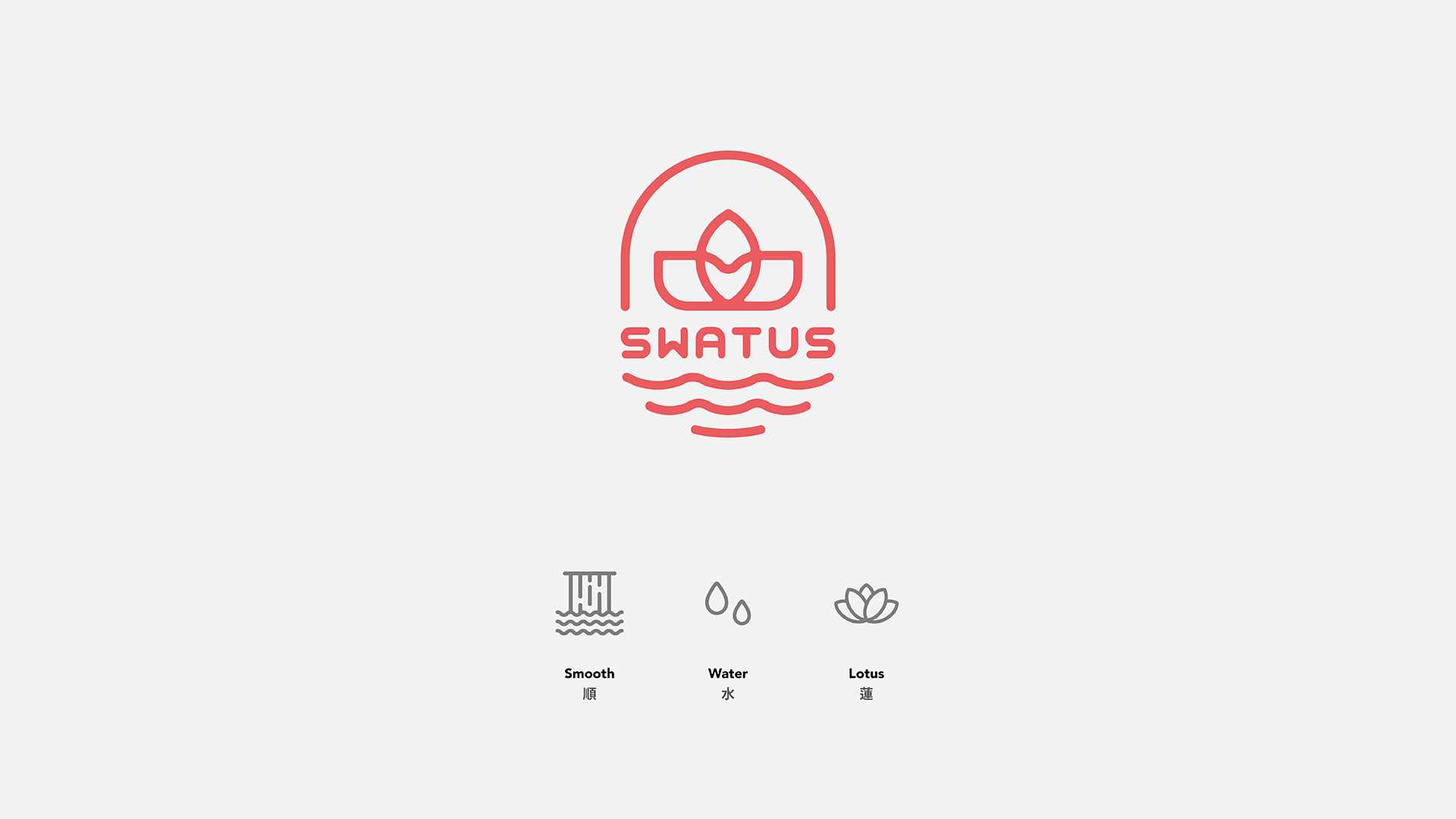
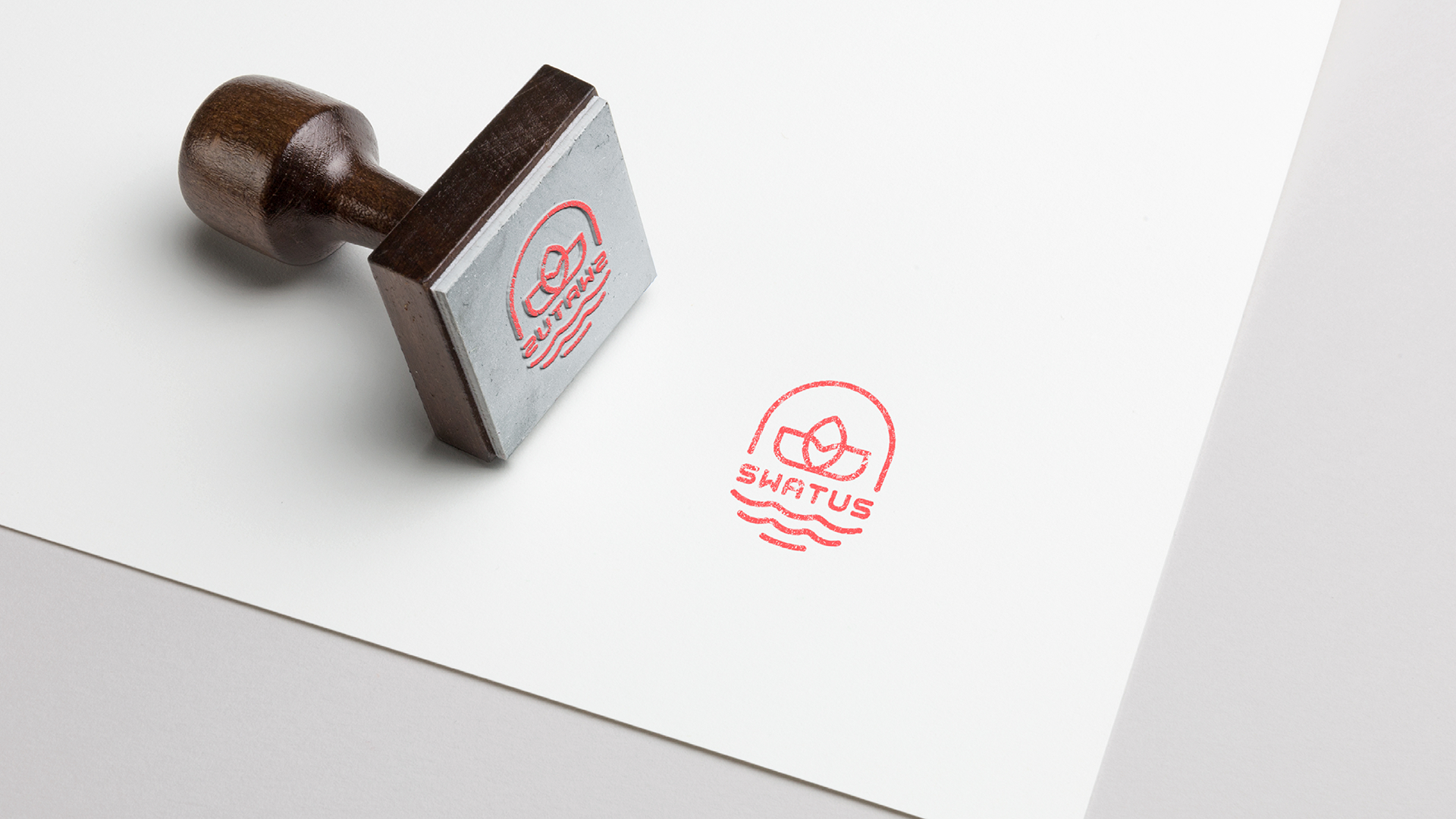
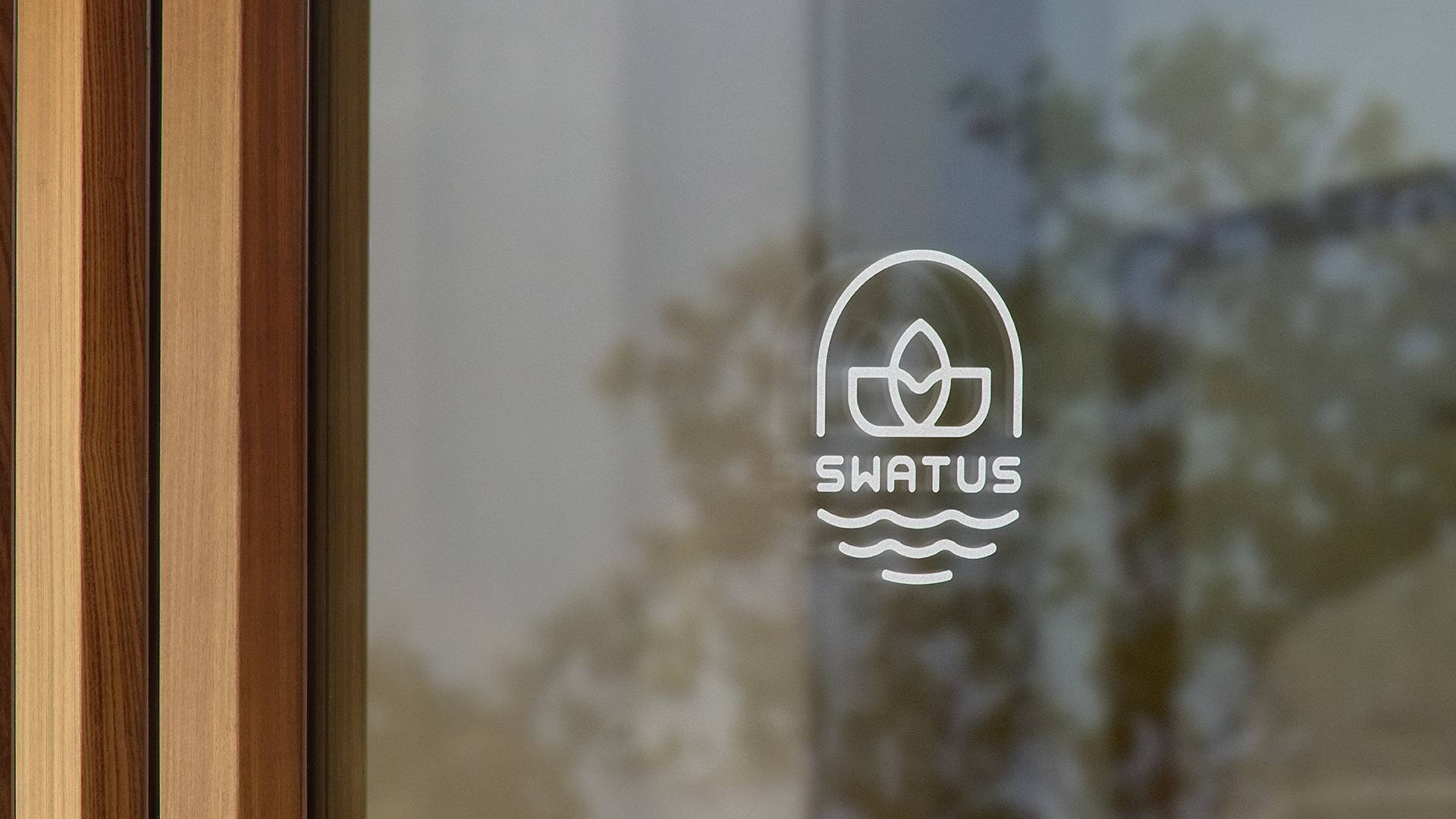
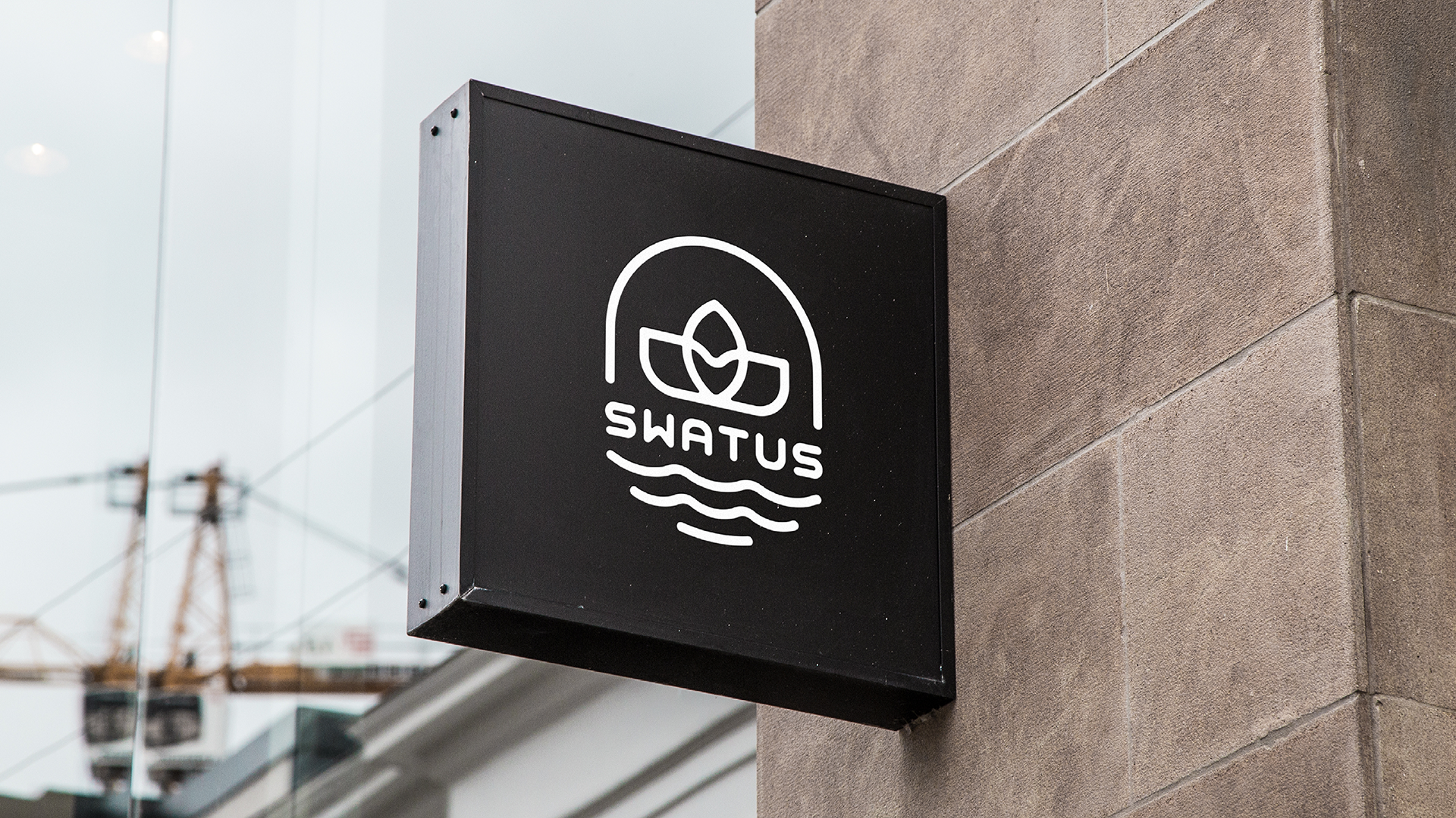
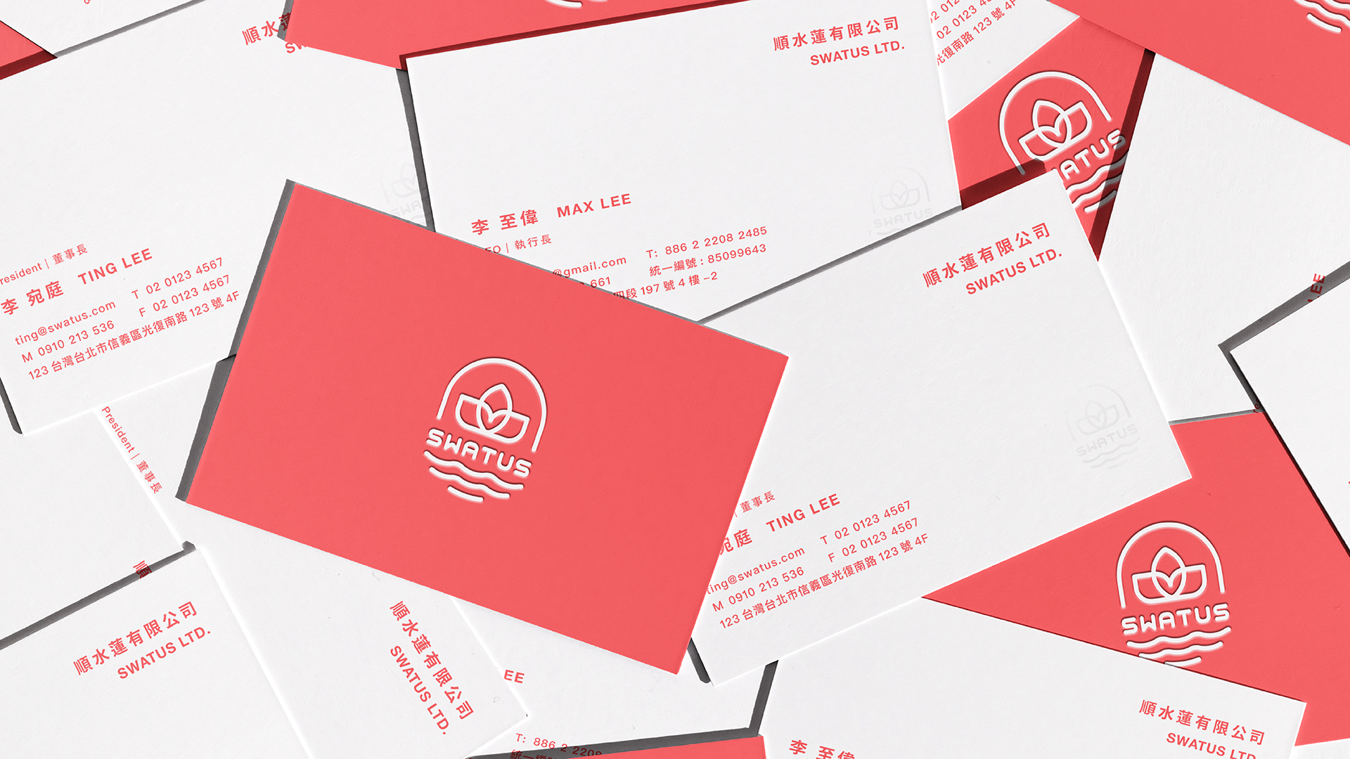
Swatus is a recently launched trading startup that specialises in importing high-quality goods and food products. The company's logo and name comprise three meaningful elements, reflecting the preferences of our client. The 'S' signifies Smooth, 'Wa' represents water, and 'Tus' symbolises the lotus. Swatus aspires for every import trade endeavour to flourish akin to the graceful growth of a lotus on water. The incorporation of these elements not only adds significance to the brand but also aligns with our client's vision of success and elegance in the import business.
Swatus 是一家新創成立的貿易初創公司,專門進口高品質商品和食品產品。公司的標誌和名稱包含三個有意義的元素,反映了我們客戶的偏好。'S'代表平順(Smooth),'Wa'代表水(Water),而'Tus'則象徵蓮花(Lotus)。Swatus 渴望每一次進口貿易都能像蓮花在水上優雅生長、一樣繁榮盛開。這些元素的融合不僅為品牌增添了意義,也與我們客戶在進口業務中追求成功和優雅的願景相一致。