
Logofolio
Branding

Not every project needs a full identity system. Some clients start with something smaller: a single, well-made logo that gives them a clear mark to begin with, and room to grow into more later. This selection brings together logos for cafés, restaurants, studios, and young brands, each designed to be simple, flexible, and ready for whatever comes next.
Client
Selected Clients
Location
Taiwan
Year
2015-2023


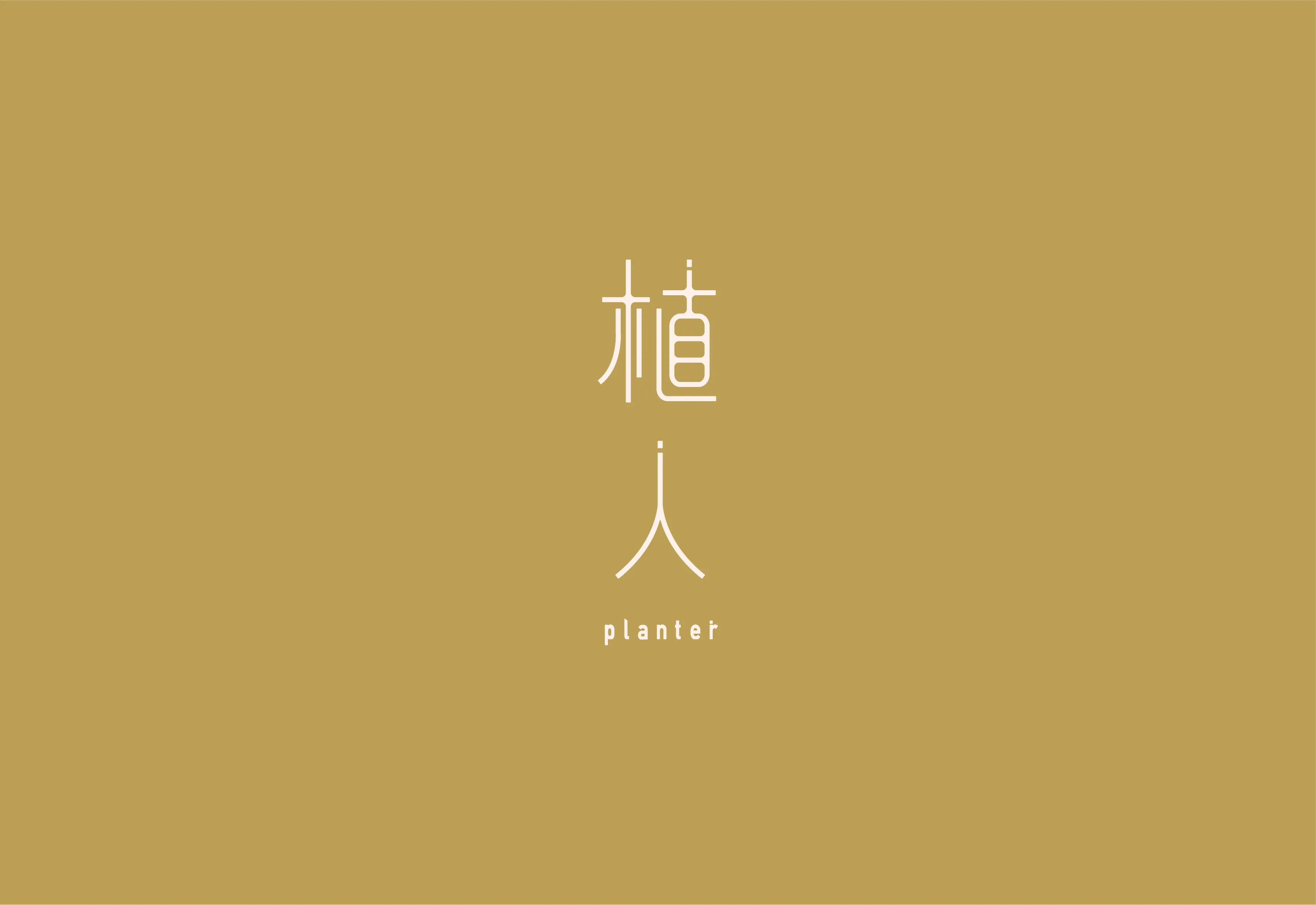
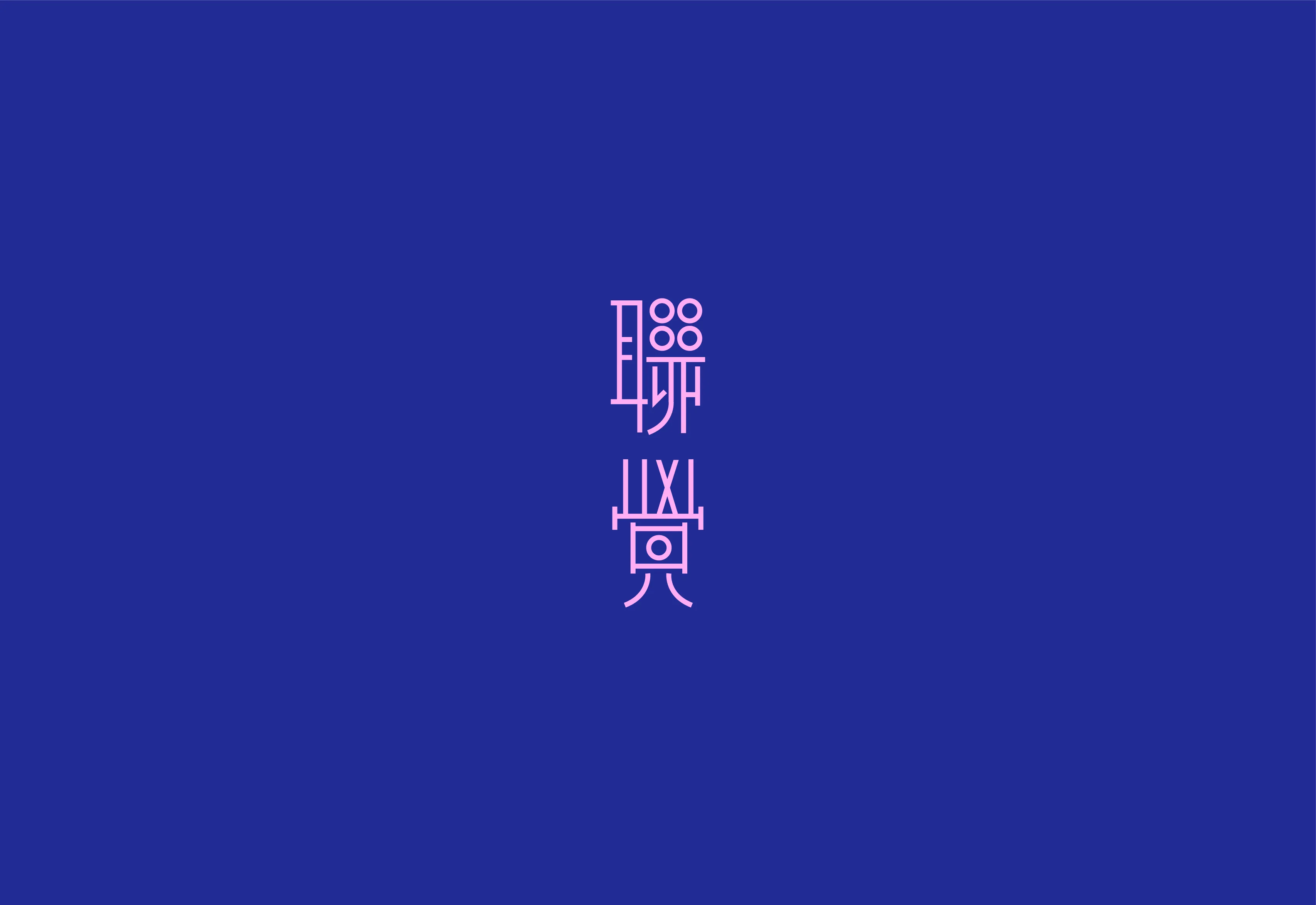
Many of the marks start from Chinese characters themselves. Strokes are redrawn, joined, or opened up so the name becomes the symbol, paired with a Latin wordmark where the brand needs one. The aim is a mark that reads clearly in both scripts and still feels distinctive at small sizes.



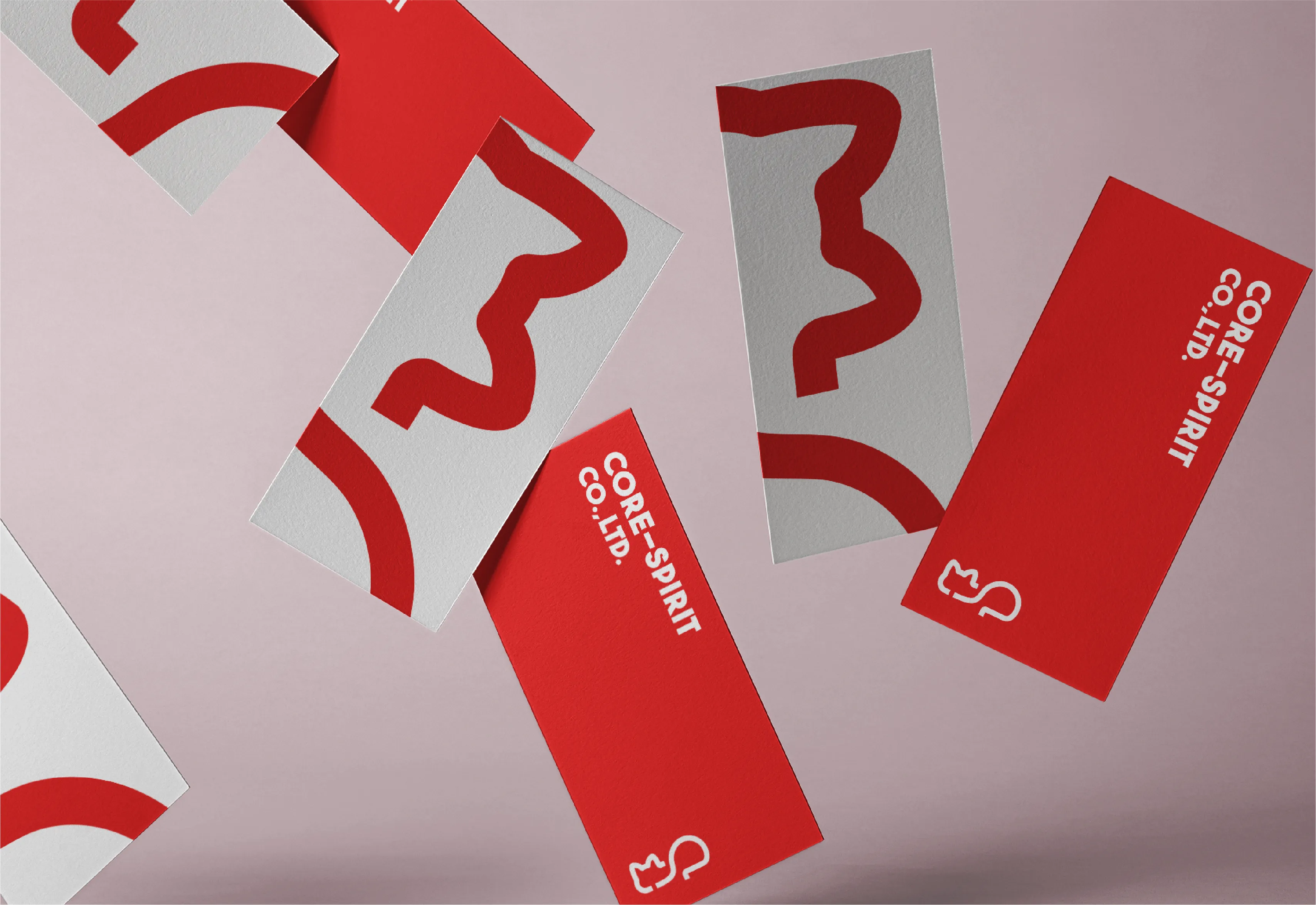
For food and lifestyle brands, the marks lean friendlier. Simple, rounded shapes take cues from the product or the name, a donut, a heart, a sleeping cat, and keep their character even when reduced to a single colour. They are meant to be quickly recognised and easy to use across packaging, signage, and social media.
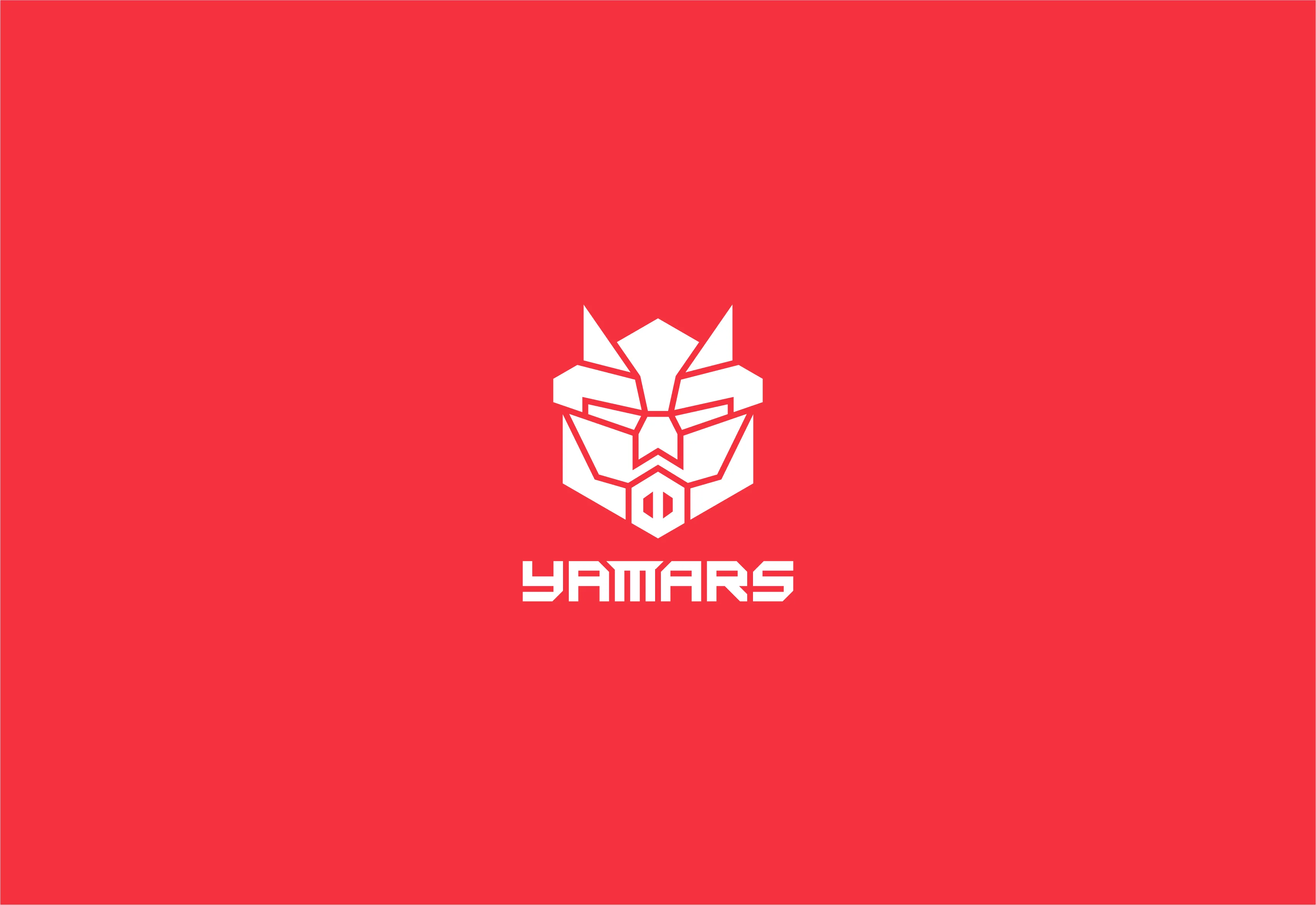


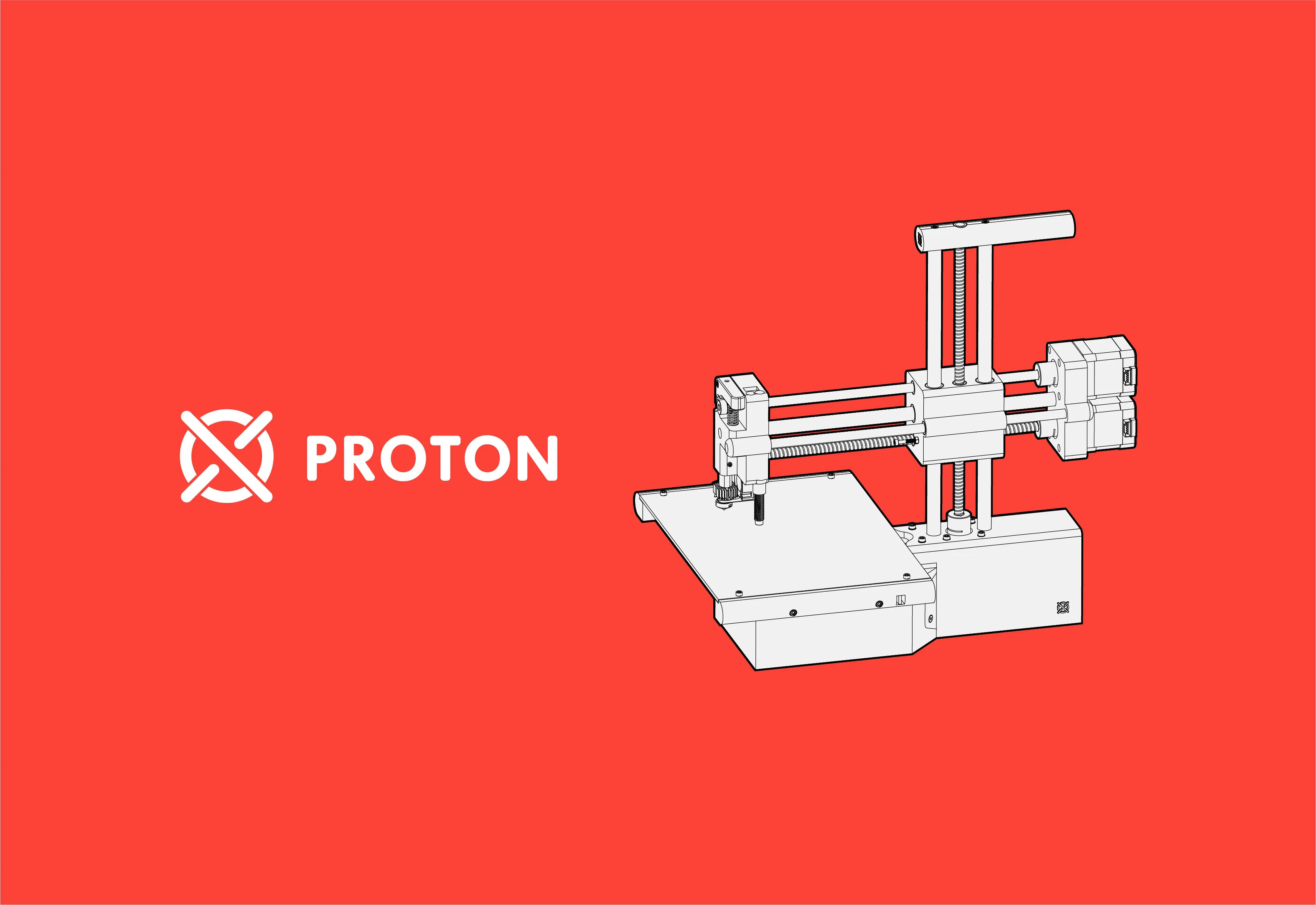
Tech and product brands call for a more structured approach. Geometric forms, modular grids, and clean lettering give these marks a precise, built-to-scale feel, ready to sit on a device, a screen, or a product label without losing clarity.


Credits
Graphic Design
Jian Xin Wang