
Super Double
Branding, Packaging, Photography

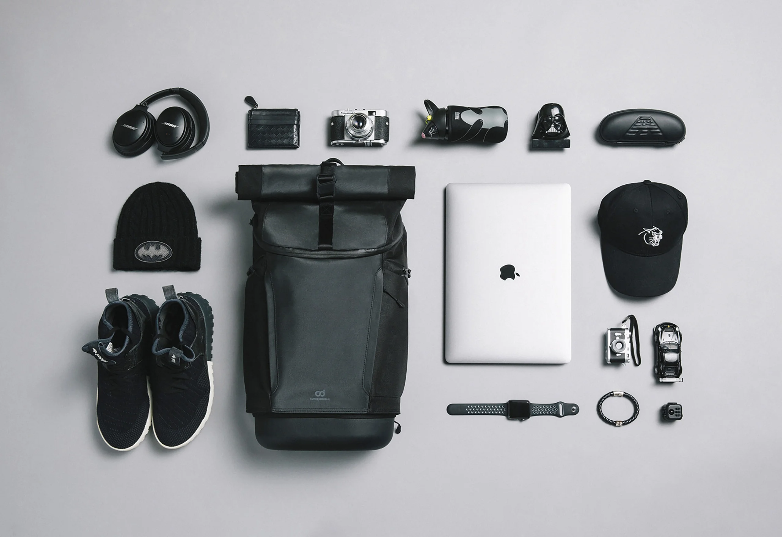
Super Double launched its first functional backpack in 2018, designed by a team of industrial designers and former fashion editors. Built around the idea of "one-second, one-hand access," the bag found its first fans among parents managing kids and gear, then spread to commuters, designers, and anyone tired of digging through a bag one-handed. The crowdfunding campaign that followed raised NT$15 million.
Client
Super Double
Location
Taiwan
Year
2018

The mark reads on three levels at once. The circular form comes straight from the shape of the snap-case, the backpack's signature detail. Read as letters, it becomes S and D. Read as a whole, it's two interlocking circles, a nod to the founder's two children and to the "double" in the name itself.

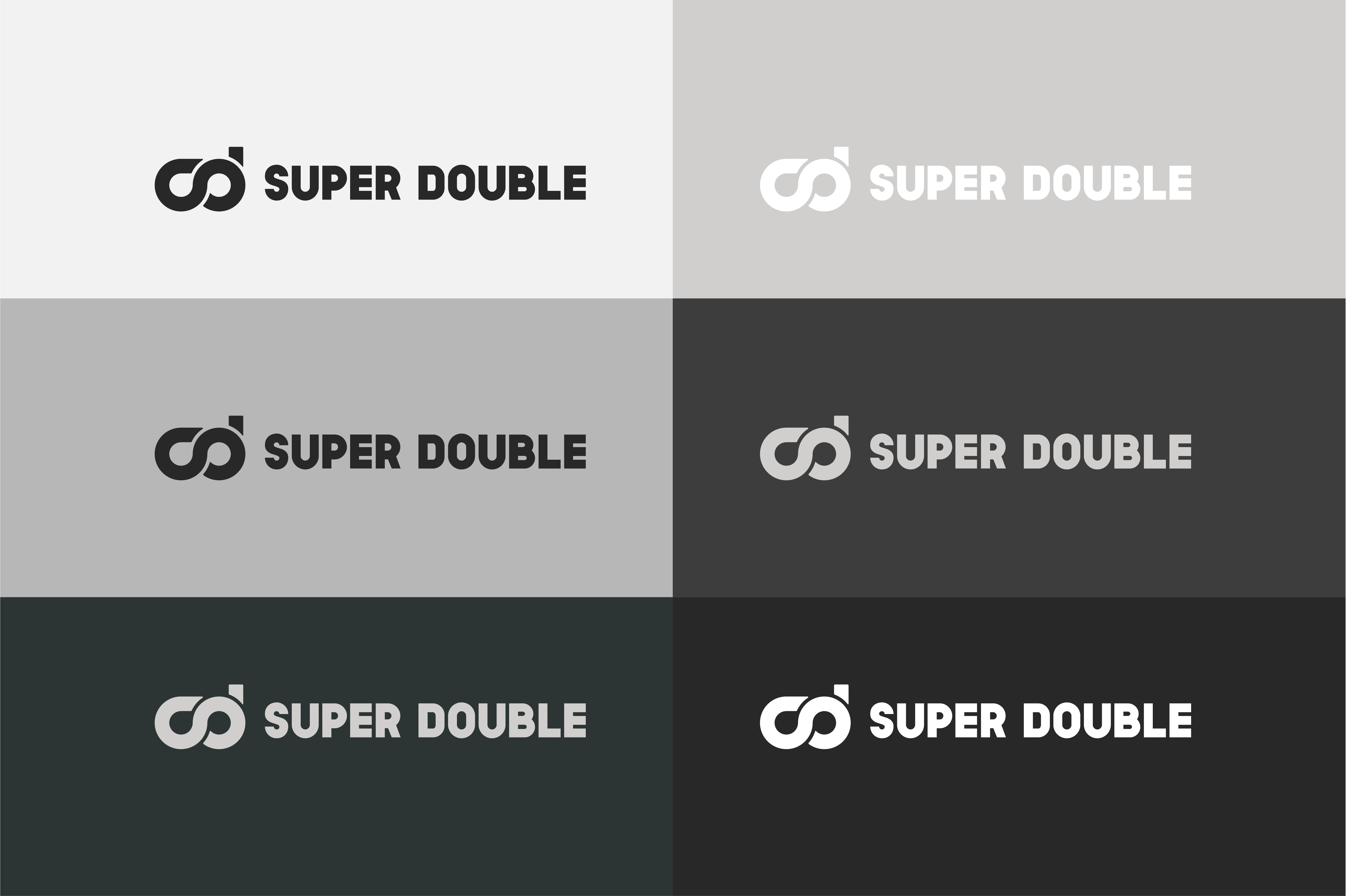
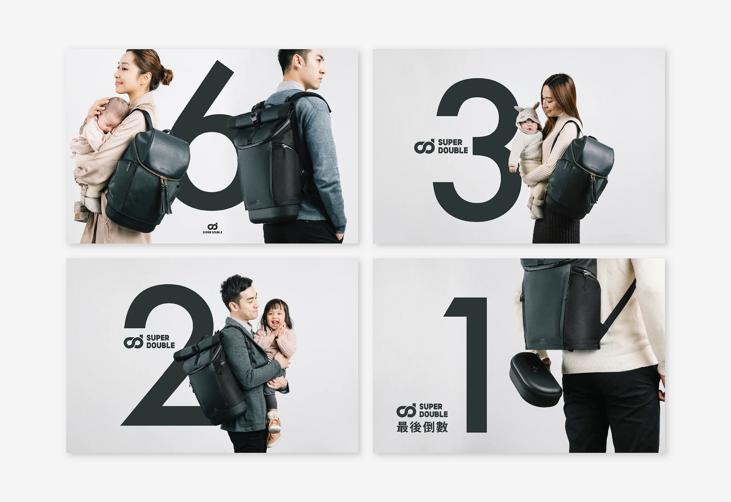
The visual identity stays in black, white, and grey, balancing sport and function with a quieter sense of style, closer to athletic performance wear than to anything with the cold distance of high fashion. It was built for an audience that skews practical over trendy, working adults and couples who want something that performs well and still looks considered.


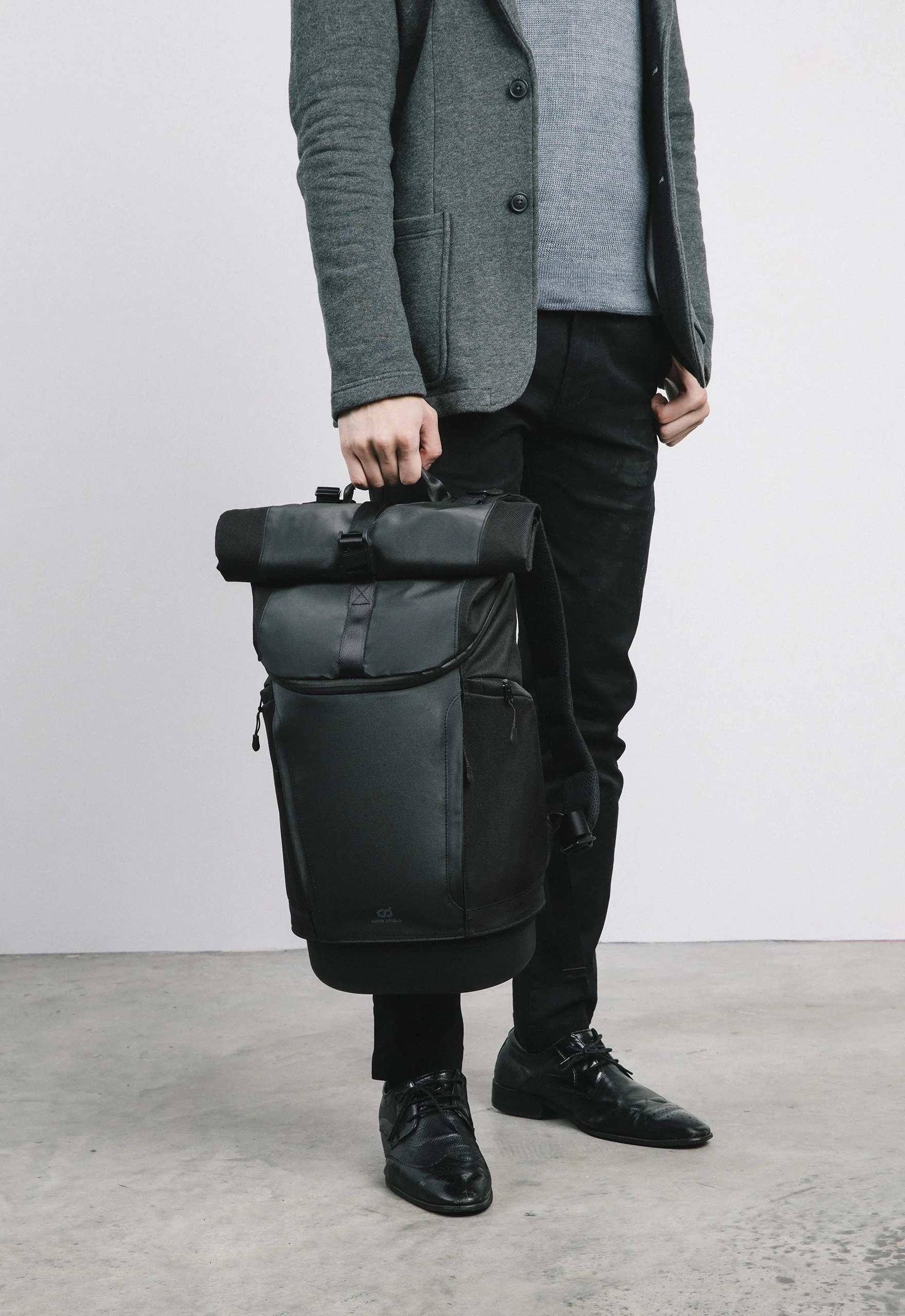

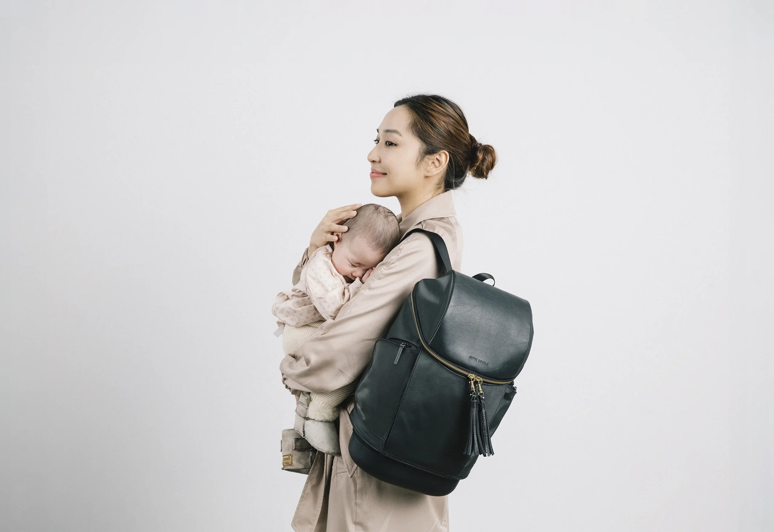
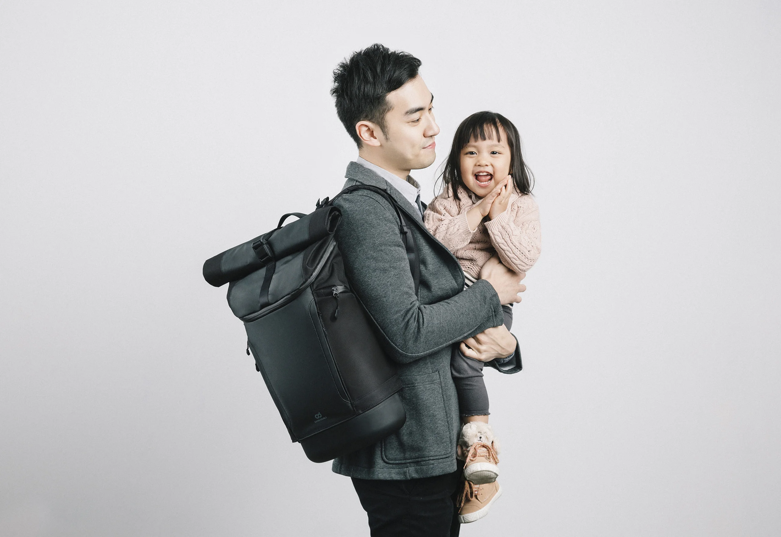
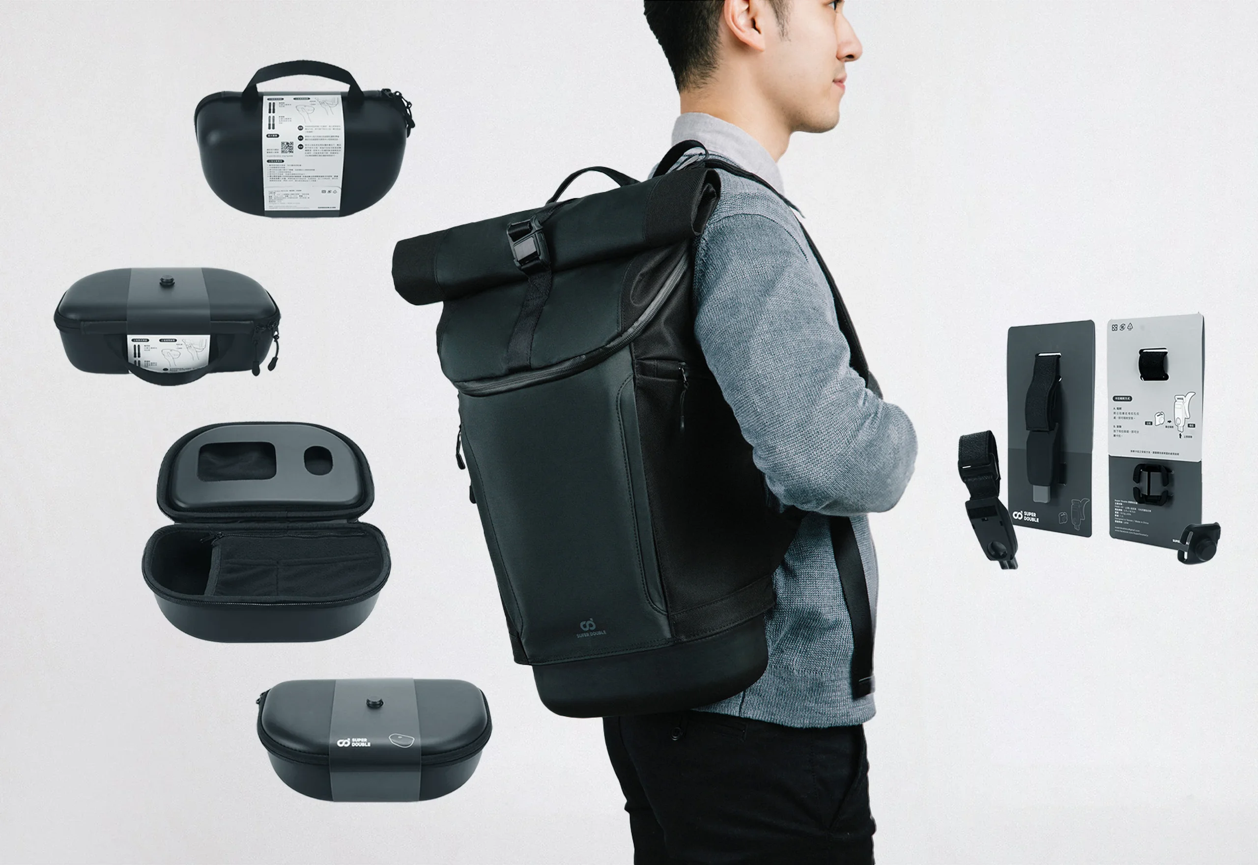
Every detail on the bag earns its place. The stand-out is the snap-case at the base, a compartment for the small stuff, snacks, a power bank, a toiletry kit, that clips on and off with a set of magnetic buckles. Simple to use with one hand, which was the whole point from the start.


Credits
Creative Director
Branding
Graphic Design
Product Design
Photographer
Lawrence Lee, Shelly Kuo
Jian Xin Wang, Super Double Team
Jian Xin Wang
Shelly Kuo, Coby Huang, Lyan Huang
Uliz Hung